
Introduction
During this half term, two main projects have been undertaken: data visualisation and the design of publications. Data visualisation can be the projection of collected or simulated data into recognizable graphic and pictorial forms using technical means such as the application of electronic computer image processing, graphics and man-machine interaction techniques. Publication design, the most representative part of the graphic design art, edits and arranges specific visual information elements on a page according to the need for thematic expression.
The following reflections are based on DIEP principles.
Describe
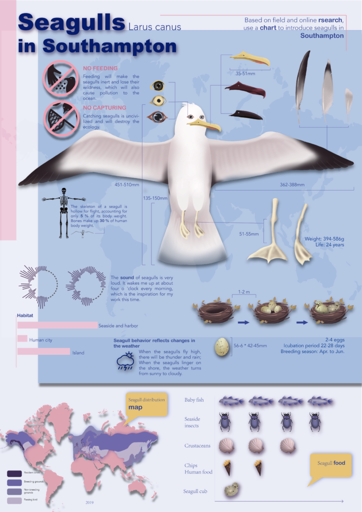
William Playfair’s ‘Bar Charts in Business and Politics’ of 1786 is a landmark in graphic design (Fig. 1) and has taught us much. The visualisation of data helps people to analyse and summarise it. I learnt the basic way of representing data graphically. It is very clear that I have also used graphical comparisons to represent differences in data in my designs. You can see this in Fig. 2.
A large part of the poetry in the publications I was assigned to design was about nature, a product of romanticism. I wanted the books I designed to look like the poet’s own notebooks/sketchnotes with free spontaneous sketches and manuscripts. Here I studied Mike Lord’s approach to sketchnotes (Fig. 3), where the drawings highlight the text and the text explains the drawings. Sketchnote has colour in it, graphic elements and different types of typography all helping to reflect the subject matter. My overall style uses a combination of text and illustration on the inside pages. I bound it in button-hole staples (Fig. 4) to give it a more unified and free look.
Interpret
Publications need to be functional, artistic and unified. The feedback I received after the workshop was that my work lacked unity. I was aware of this myself and in the second half I sought to experiment too much, changing the previous typography and making the front and back sections quite different. There has to be a logical organisation and arrangement between the various elements and a unified style in the design as a whole. By strengthening the overall structural organisation, the situations and colours should echo each other, and the elements should complement and set off each other to ensure the unity of the design. I refine my work with feedback and help. These feedbacks give me an insight of the whole design work in different view.
The collection and analysis of data, the accuracy of graphs and charts and the visual presentation of information in data visualisation (project 1) is very important. In the scientific infographic I created was based on internet searches and my photography. Determining accurate information was the first step in completing the chart. There is a lot of rigorous and precise data in the chart, and I needed to complete it to a uniform scale, which is something I found difficult. However, in my opinion, infographics convey more information through drawings and are more interesting than other charts that are mostly diagrams.
Evaluate
Ensuring that the content of the work is consistent was the main issue I found this time. As the main design method, I use is illustration, I should ensure that the drawing style is consistent. Within a complete design piece, the style of drawing should be consistent to create an overall visual style and visual perception. As society develops and people’s aesthetic standards improve, the design of publications becomes increasingly important. It is important that the overall style of a publication is uniform. In the case of data visualisation, graphics can help to enhance the visibility of information compared to data and can maintain interest when analysing data.
The second thing I lacked was confirm the target audience, which would have made my design goals more clear. I have been reminded twice about this. Each time I started designing before I had a clear target audience, which made my designs very confusing. Because I want to cater for the majority of people when dealing with an unclear target audience, I add as many design elements as possible, some of which are very unnecessary, which makes my work lack purpose and is a major reason for its inconsistent style.
Plan
Many of my future design plans and employment plans are based on illustration design. Uniformity of image and illustration practice has been very helpful to me. Illustration is the main direction I want to pursue in the future. The process of creating this project has given me more experience and identified problems.
When I am clear about this goal, I will be more focused in my future accumulations and summaries. It will help me to study more efficiently and learn more styles and methods of illustration.
Summary
These two projects have broadened my view on illustration design, and I hope to use different forms of illustration in different design works. Each project has helped me to practice different skills and identify different issues. In the future, I would like to record the problems and summarise and correct them to gradually improve my own designs.
Reference
Fig.1

Source: https://en.wikipedia.org/wiki/File:Playfair_Barchart.gif
Fig.2
Source: my own work
Fig.3 Mike Rohde’s work

Source: https://thedoodlerevolution.com/showcase/ted-08-dave-eggers-sketchnote-01-02/
Fig.4

Source: my own work